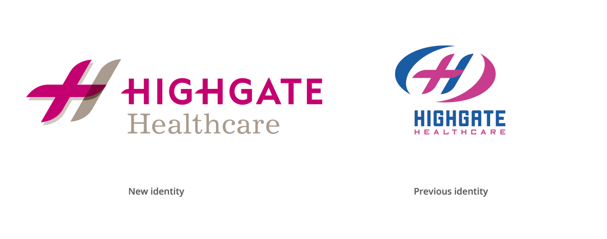
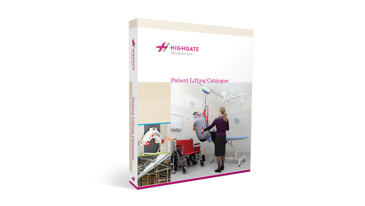
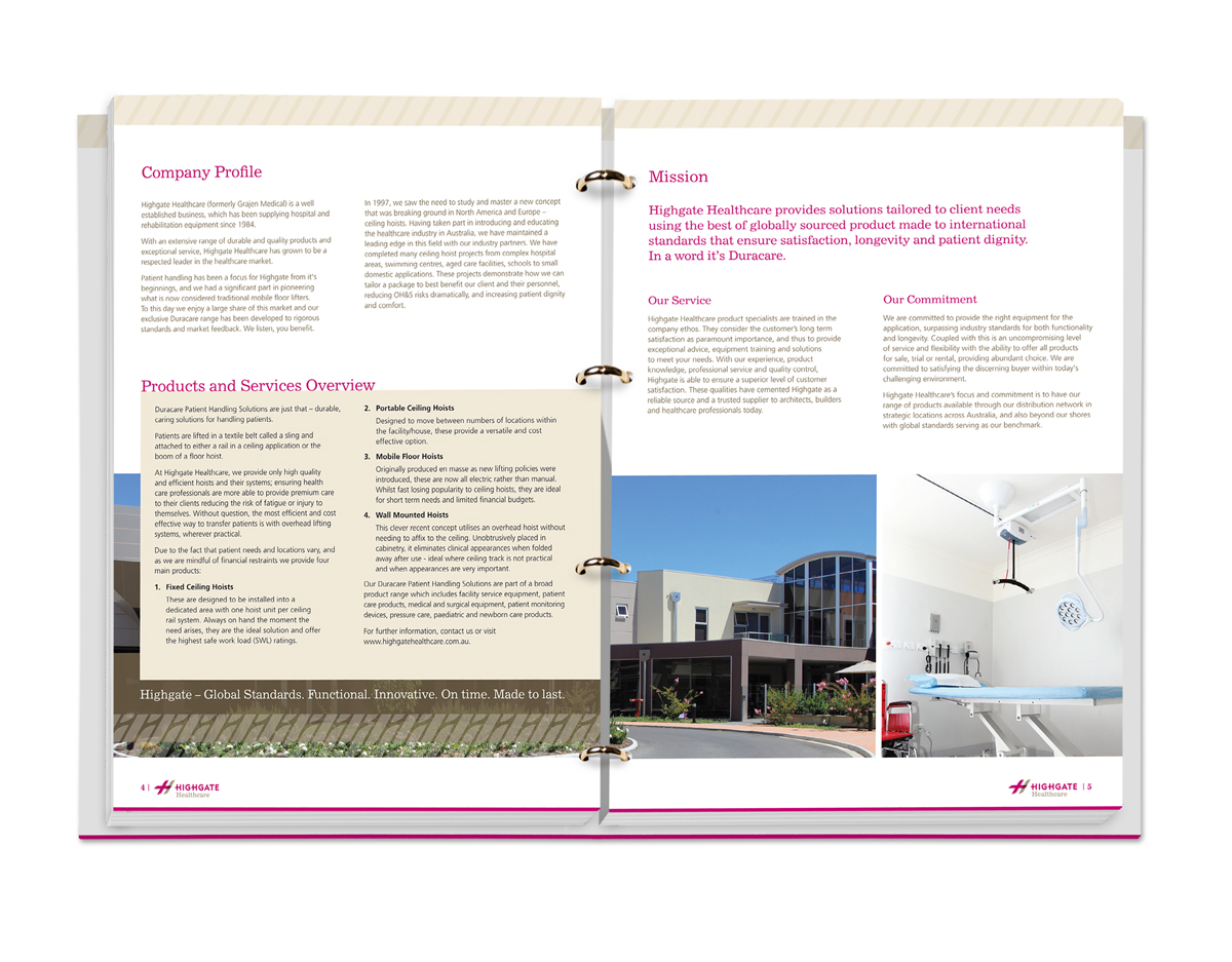
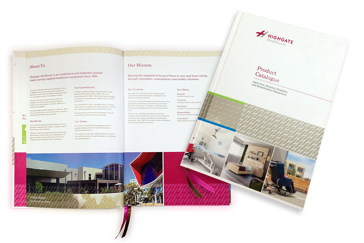
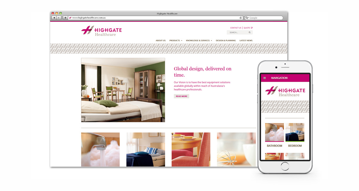
The Highgate Healthcare brand was updated with a clean, contemporary look to present them as a reliable and innovative supplier in the healthcare industry. The brand also needed a friendly, caring feel due to the nature of this industry.
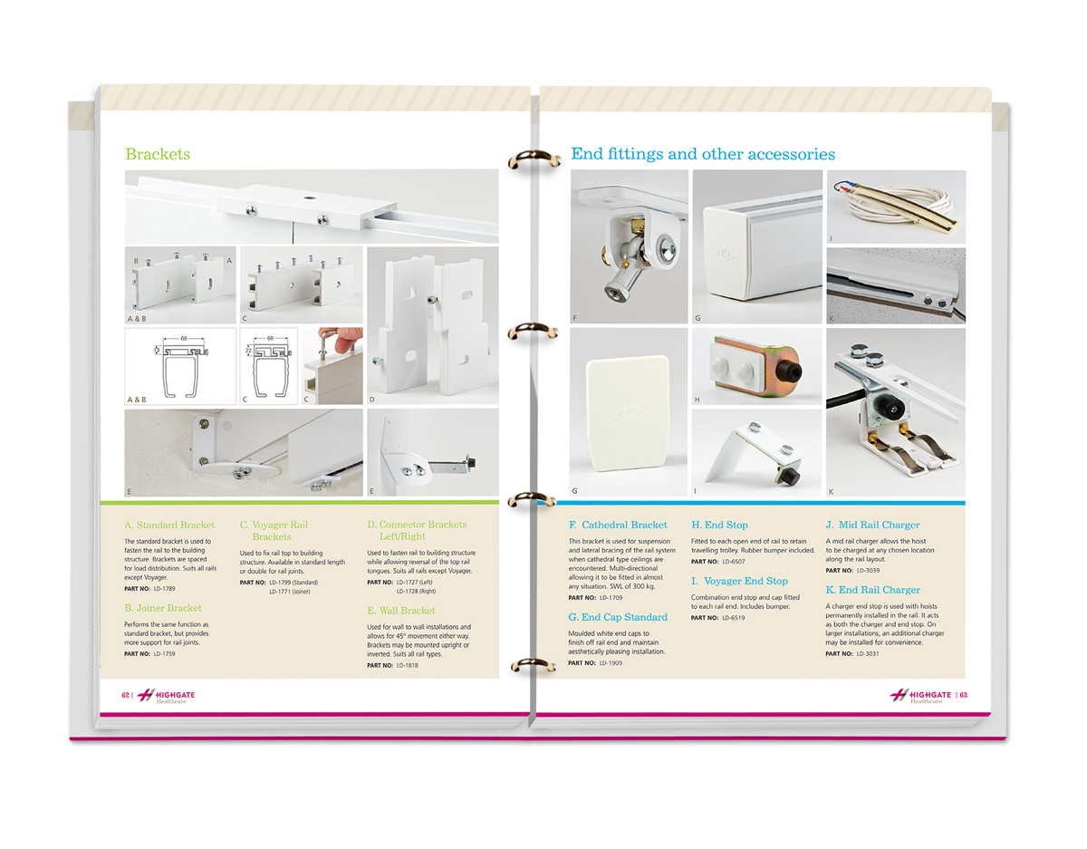
The identity and style guide uses a combination of serif and sans serif fonts to express both the corporate professionalism and friendliness of the brand.
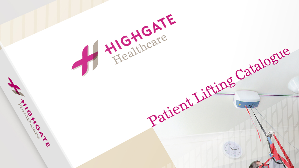
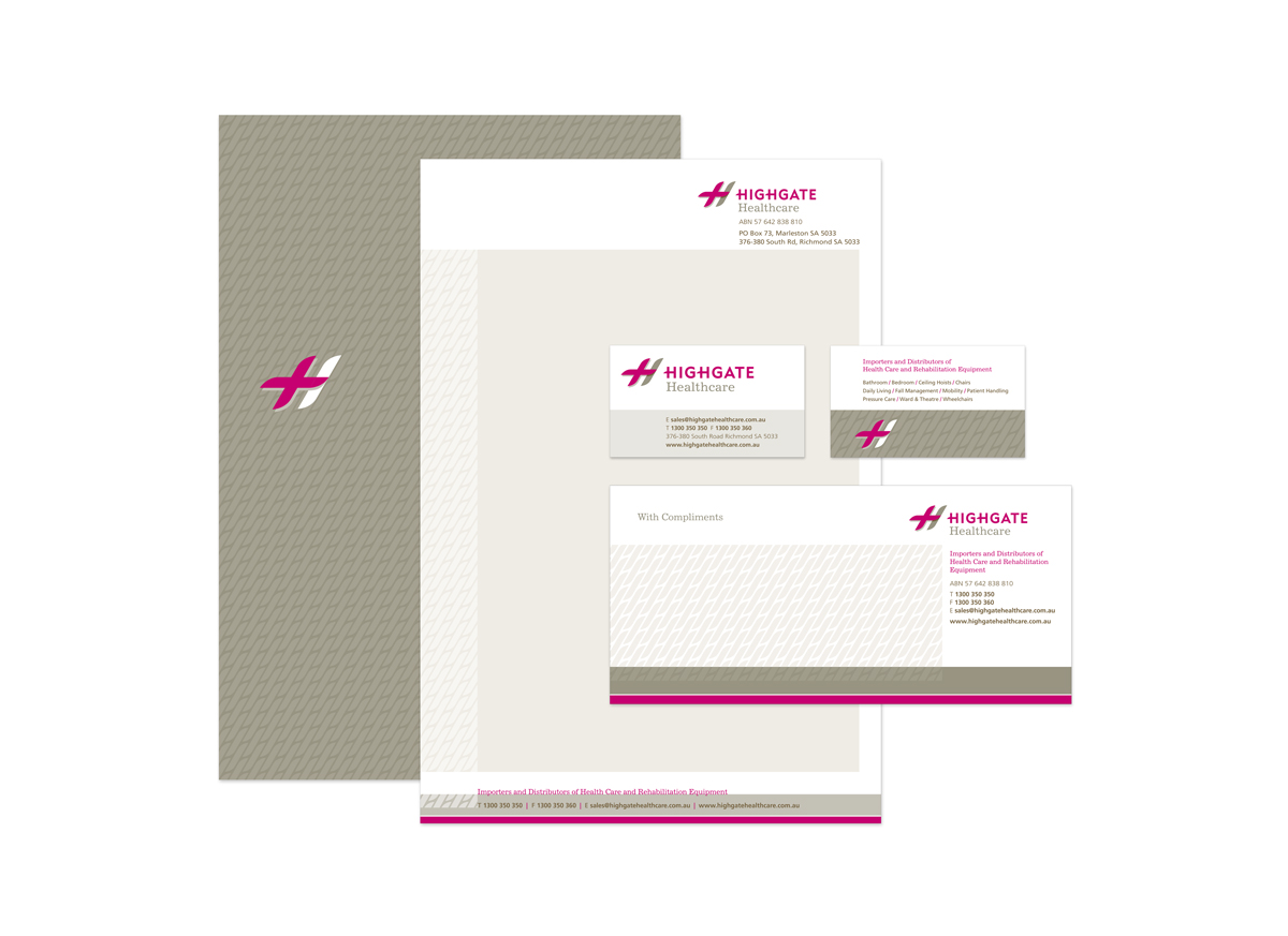
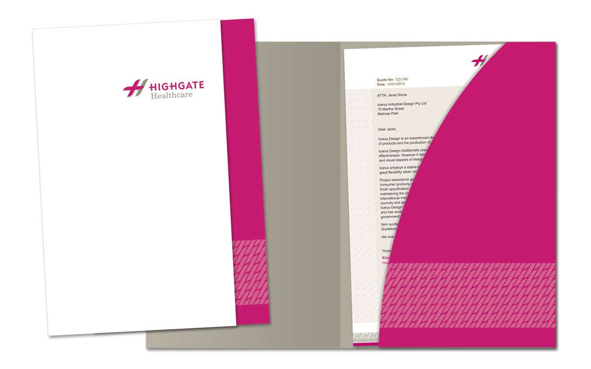
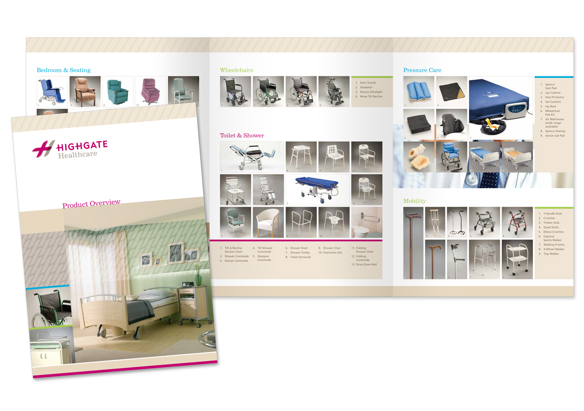
We applied our updated version of the Highgate logo and a new style guide to the stationery, building signage, marketing material, website and product catalogue. Improving the look and feel brought the brand up to date for the healthcare industry. With the addition of navigation tools such as title pages, dividers and a comprehensive index, the catalogue now functions more effectively and is easier to use.
Services
Identity & Branding | Print | Web design
Location
Adelaide, South Australia
